
Sib Sabz
Overview
Sib Sabz is an advertising agency that offers services such as website design, catalog design, advertising photography, and logo design for various brands and businesses. The goal of this project was to redesign the agency’s website to create a more modern, visually appealing, and user-friendly experience.
A key focus of the redesign was improving the mobile experience. Instead of a traditional responsive layout, the mobile version was designed to feel closer to an application, making navigation easier and allowing users to explore services, portfolio projects, and client brands more efficiently. The final design emphasizes clean layouts, clear content hierarchy, and a simple navigation structure.
Client
Sib Sabz
Date
Categories
Sib Sabz Advertising Agency
Web Design

Product Overview
Sib Sabz is an advertising agency that provides creative services such as website design, catalog design, advertising photography, and logo design for different brands and businesses.
In 2022, I worked on redesigning the agency’s website to improve both the visual presentation and usability of the platform. The previous website was built using WordPress and the client wanted to rebuild the website with a more modern design and a clearer structure.
One of the main requests from the client was to create a mobile experience that feels closer to a mobile application rather than a traditional responsive website.
The redesign focuses on presenting the agency’s services, portfolio, and clients in a more structured and visually engaging way.
Responsibility
UX & UI Design
User Research
Information architecture
Wireframing
Mobile experience design
Final visual interface design
The project involved collaboration with the company’s team, including one of the company’s graphic designers who participated in review sessions and provided feedback during the design process.
The final designs were later delivered to the development team for implementation.
Tools
Figma
Adobe XD
Adobe Photoshop
Problem Statement
The previous version of the website did not provide a smooth browsing experience on mobile devices. Navigation between different sections required multiple steps and the overall structure did not highlight the agency’s portfolio effectively. Since many users were visiting the website from mobile devices, the client wanted a solution that would make the mobile experience more intuitive and closer to an app-like interaction. The challenge was to redesign the structure of the website while keeping the content accessible and easy to navigate.
Goals
The main goals of the redesign were to improve the mobile browsing experience and create an interface that feels more like a mobile application. The design also aimed to make services and portfolio items easier to explore while presenting client brands in a way that builds trust and organizing the website’s sections in a clearer structure.
Design Process
Reviewing the Existing Website
The first step was reviewing the structure of the existing WordPress website and identifying the main sections that needed improvement.
This included analyzing how services, portfolio items, and client brands were presented.
The goal was to simplify the structure and make important sections easier to access.
Defining Key Sections
Based on the website content and client needs, the main sections were structured as:
Services
Latest projects / portfolio
Client brands
Team members
Articles / magazine
These sections were designed to highlight the agency’s work while keeping navigation simple.
Wireframing & Layout Exploration
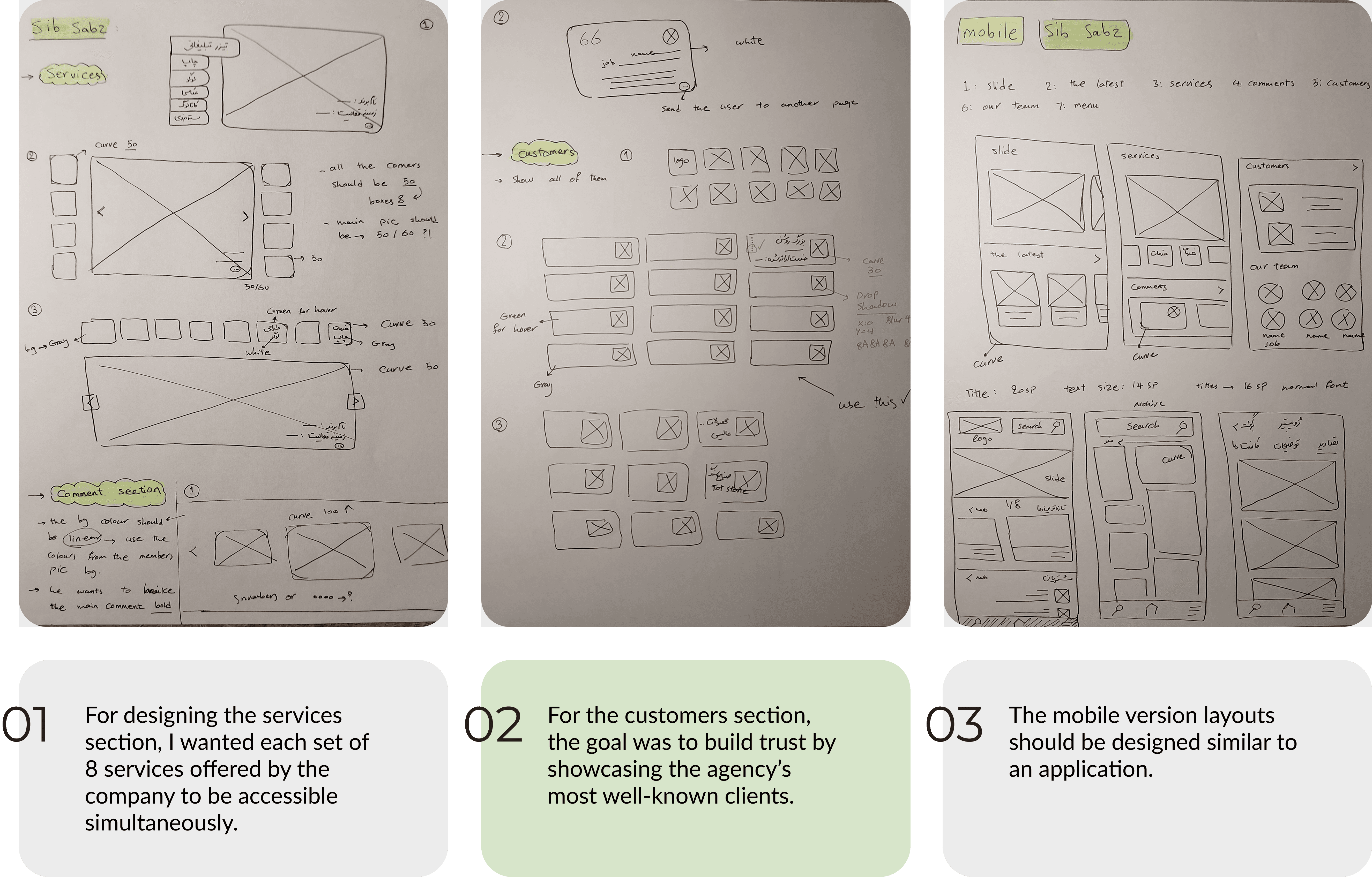
Before moving to visual design, I created layout sketches to explore different ways of organizing the content. These focused on defining content hierarchy, structuring service categories and portfolio items, and presenting client brands in a balanced way. The sketches helped shape the final layout of the homepage and other key pages.
Mobile Interface
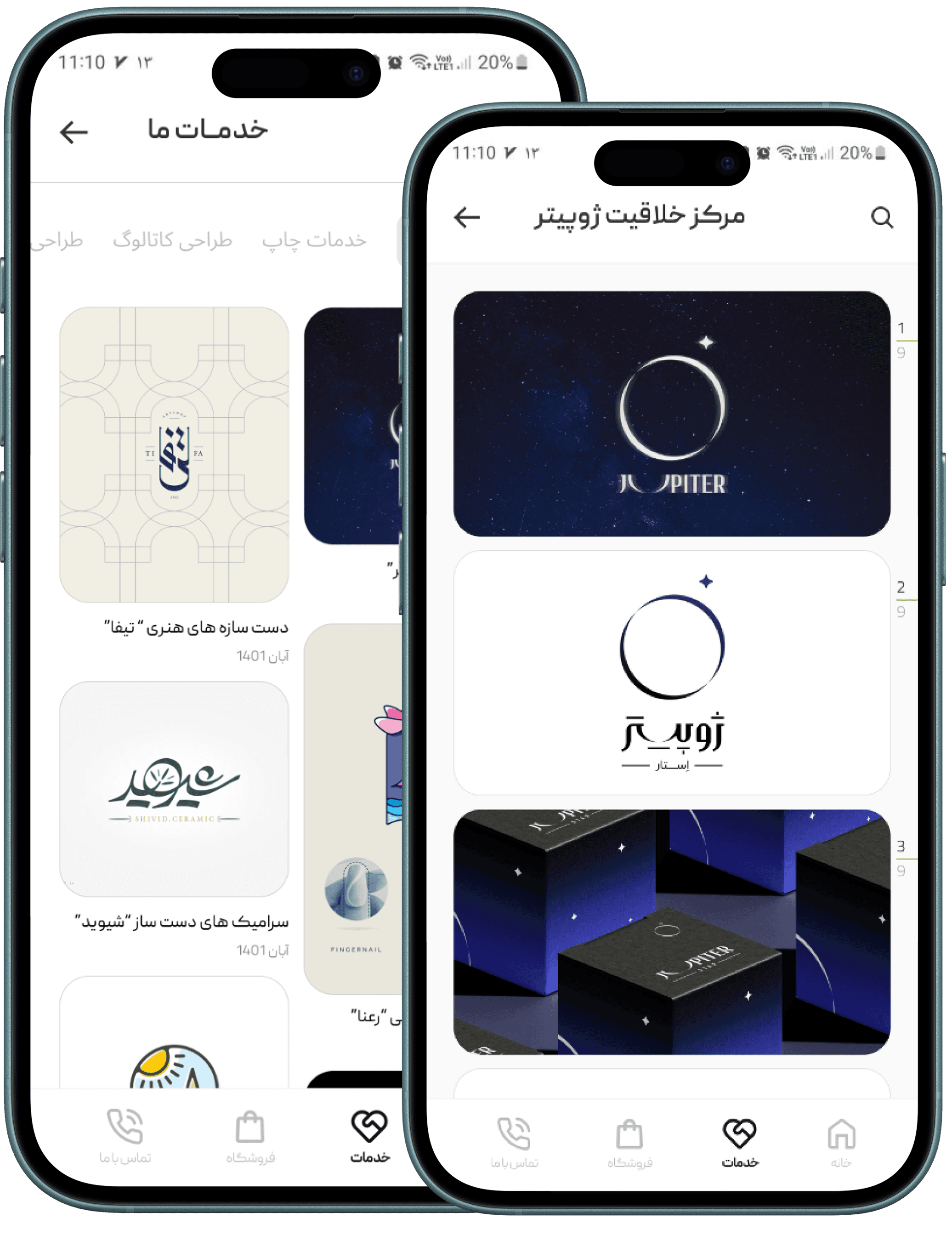
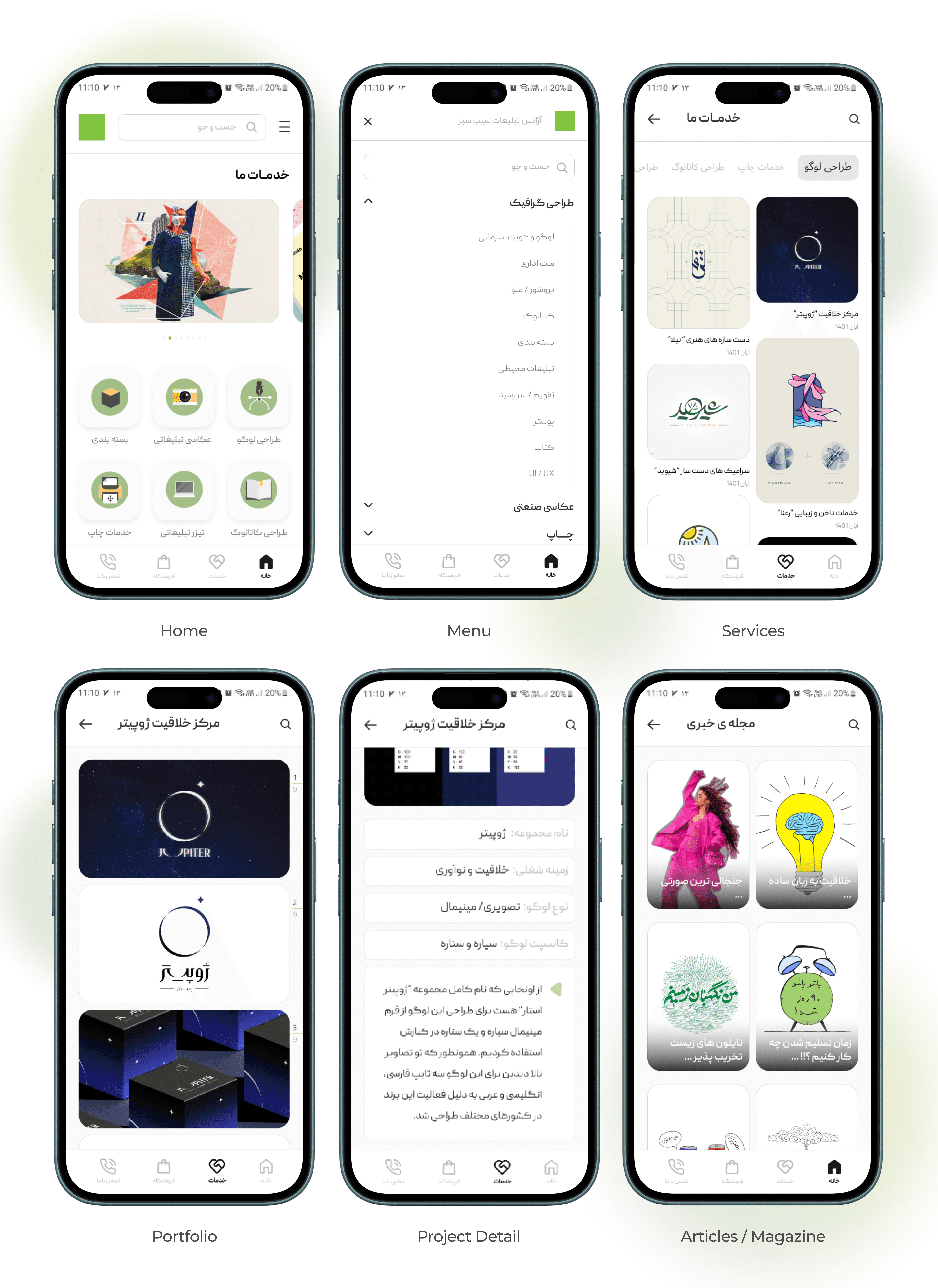
The mobile interface was designed with an app-like experience, using bottom navigation and card-based layouts to make browsing services and portfolio items easier.
Key Website Pages
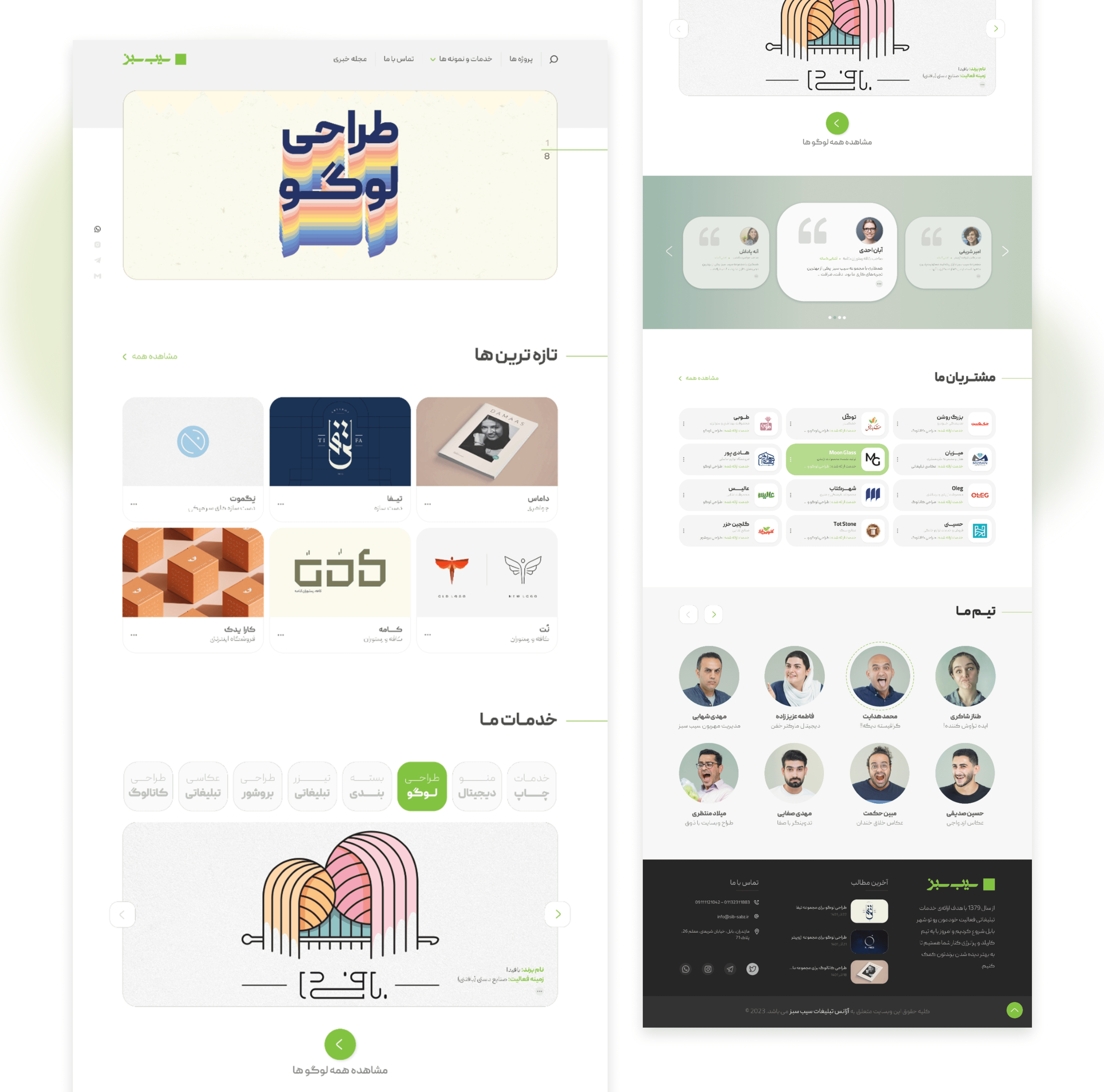
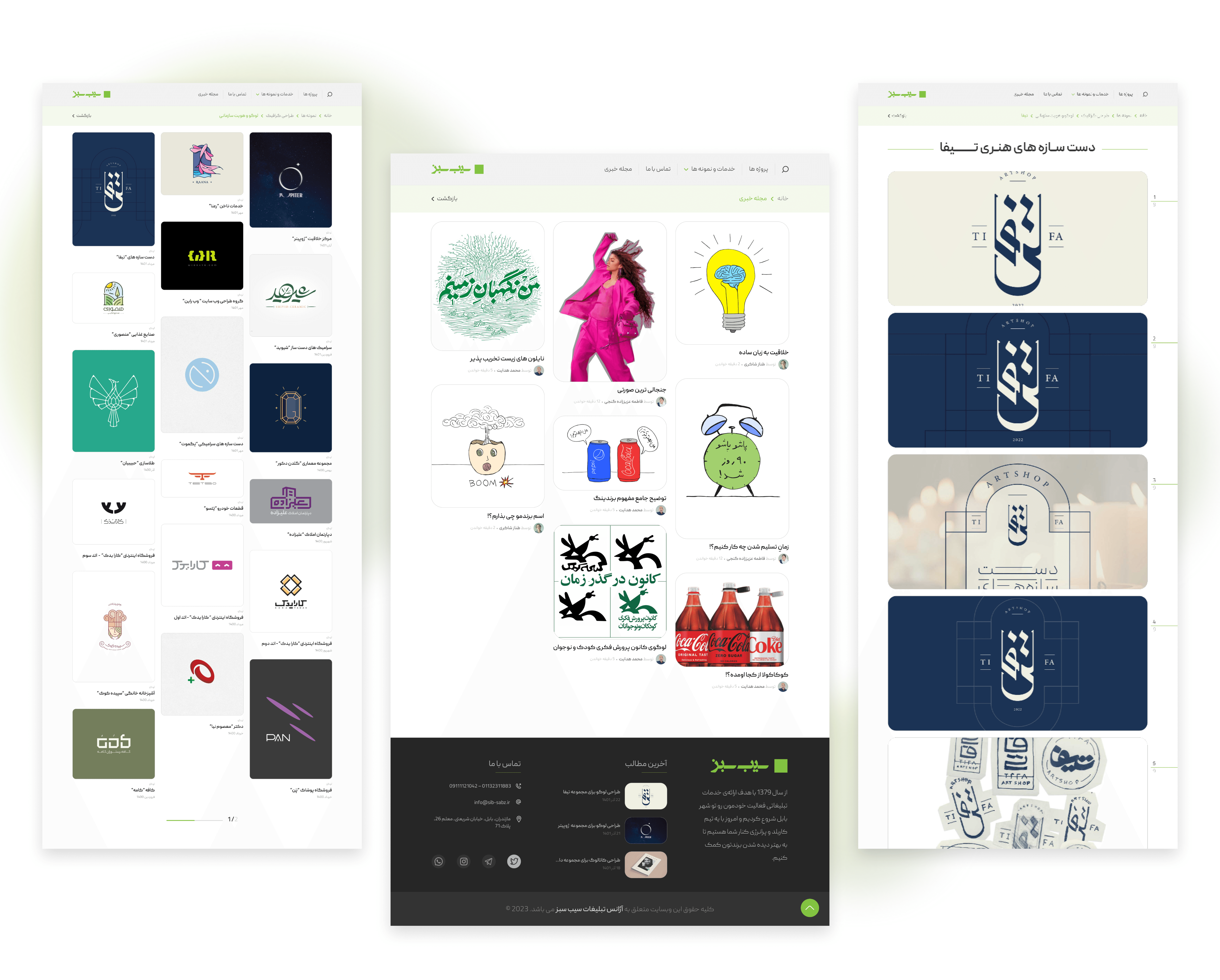
The desktop version focuses on showcasing portfolio projects, services, and client brands with a clean and structured layout.
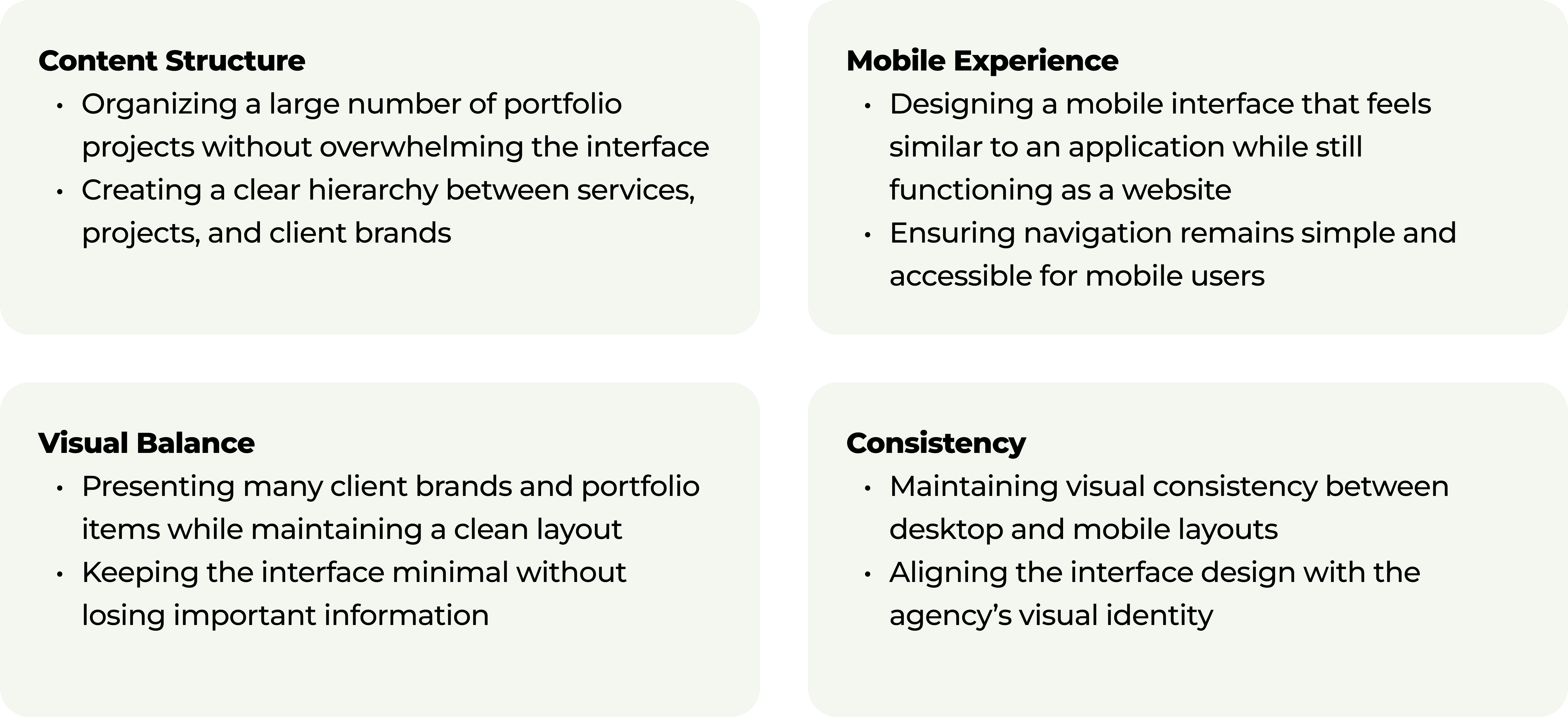
Challenges Encountered
Key Takeaways
Structuring content before starting visual design is essential
Mobile navigation patterns play a major role in usability
Clear visual hierarchy helps highlight important content
The project design was later delivered to the development team and is currently in the implementation stage.
Sib Sabz
Overview
Sib Sabz is an advertising agency that offers services such as website design, catalog design, advertising photography, and logo design for various brands and businesses. The goal of this project was to redesign the agency’s website to create a more modern, visually appealing, and user-friendly experience.
A key focus of the redesign was improving the mobile experience. Instead of a traditional responsive layout, the mobile version was designed to feel closer to an application, making navigation easier and allowing users to explore services, portfolio projects, and client brands more efficiently. The final design emphasizes clean layouts, clear content hierarchy, and a simple navigation structure.
Client
Sib Sabz
Date
Categories
Sib Sabz Advertising Agency
Web Design
Product Overview
Sib Sabz is an advertising agency that provides creative services such as website design, catalog design, advertising photography, and logo design for different brands and businesses.
In 2022, I worked on redesigning the agency’s website to improve both the visual presentation and usability of the platform. The previous website was built using WordPress and the client wanted to rebuild the website with a more modern design and a clearer structure.
One of the main requests from the client was to create a mobile experience that feels closer to a mobile application rather than a traditional responsive website.
The redesign focuses on presenting the agency’s services, portfolio, and clients in a more structured and visually engaging way.
Responsibility
UX & UI Design
User Research
Information architecture
Wireframing
Mobile experience design
Final visual interface design
The project involved collaboration with the company’s team, including one of the company’s graphic designers who participated in review sessions and provided feedback during the design process.
The final designs were later delivered to the development team for implementation.
Tools
Figma
Adobe XD
Adobe Photoshop
Problem Statement
The previous version of the website did not provide a smooth browsing experience on mobile devices. Navigation between different sections required multiple steps and the overall structure did not highlight the agency’s portfolio effectively. Since many users were visiting the website from mobile devices, the client wanted a solution that would make the mobile experience more intuitive and closer to an app-like interaction. The challenge was to redesign the structure of the website while keeping the content accessible and easy to navigate.
Goals
The main goals of the redesign were to improve the mobile browsing experience and create an interface that feels more like a mobile application. The design also aimed to make services and portfolio items easier to explore while presenting client brands in a way that builds trust and organizing the website’s sections in a clearer structure.
Design Process
Reviewing the Existing Website
The first step was reviewing the structure of the existing WordPress website and identifying the main sections that needed improvement.
This included analyzing how services, portfolio items, and client brands were presented.
The goal was to simplify the structure and make important sections easier to access.
Defining Key Sections
Based on the website content and client needs, the main sections were structured as:
Services
Latest projects / portfolio
Client brands
Team members
Articles / magazine
These sections were designed to highlight the agency’s work while keeping navigation simple.
Wireframing & Layout Exploration
Before moving to visual design, I created layout sketches to explore different ways of organizing the content. These focused on defining content hierarchy, structuring service categories and portfolio items, and presenting client brands in a balanced way. The sketches helped shape the final layout of the homepage and other key pages.
Mobile Interface
The mobile interface was designed with an app-like experience, using bottom navigation and card-based layouts to make browsing services and portfolio items easier.
Key Website Pages
The desktop version focuses on showcasing portfolio projects, services, and client brands with a clean and structured layout.
Challenges Encountered
Key Takeaways
Structuring content before starting visual design is essential
Mobile navigation patterns play a major role in usability
Clear visual hierarchy helps highlight important content
The project design was later delivered to the development team and is currently in the implementation stage.


