
5going
Overview
5Going is a mobile app that improves safety for vulnerable road users, such as cyclists and pedestrians, using vehicle-to-anything (V2X) communication. It receives real-time safety messages and warns users of nearby hazards, turning complex live data into a clear, glanceable interface. The app works in two modes, a network-based mode and a direct device-to-device mode, and was built as part of an experimental V2X demonstration environment.
My role: UI/UX Designer
Developer: Suchin Patel · Supervised by Prof. Dr.-Ing. Andreas Festag
Client
Research project at Fraunhofer IVI (Car2x Lab-THI)
Date
Categories
Car2x Lab
Mobile App

The Problem
Vulnerable road users have no simple way to receive the safety signals that connected vehicles already exchange. The design challenge was to take dense, real-time data, positions, hazard warnings, GPS accuracy, and message stats, and present it in an interface a cyclist or pedestrian can read at a glance, while moving, without distraction.
My Role
As UI/UX Designer, I owned the app's visual design and interface:
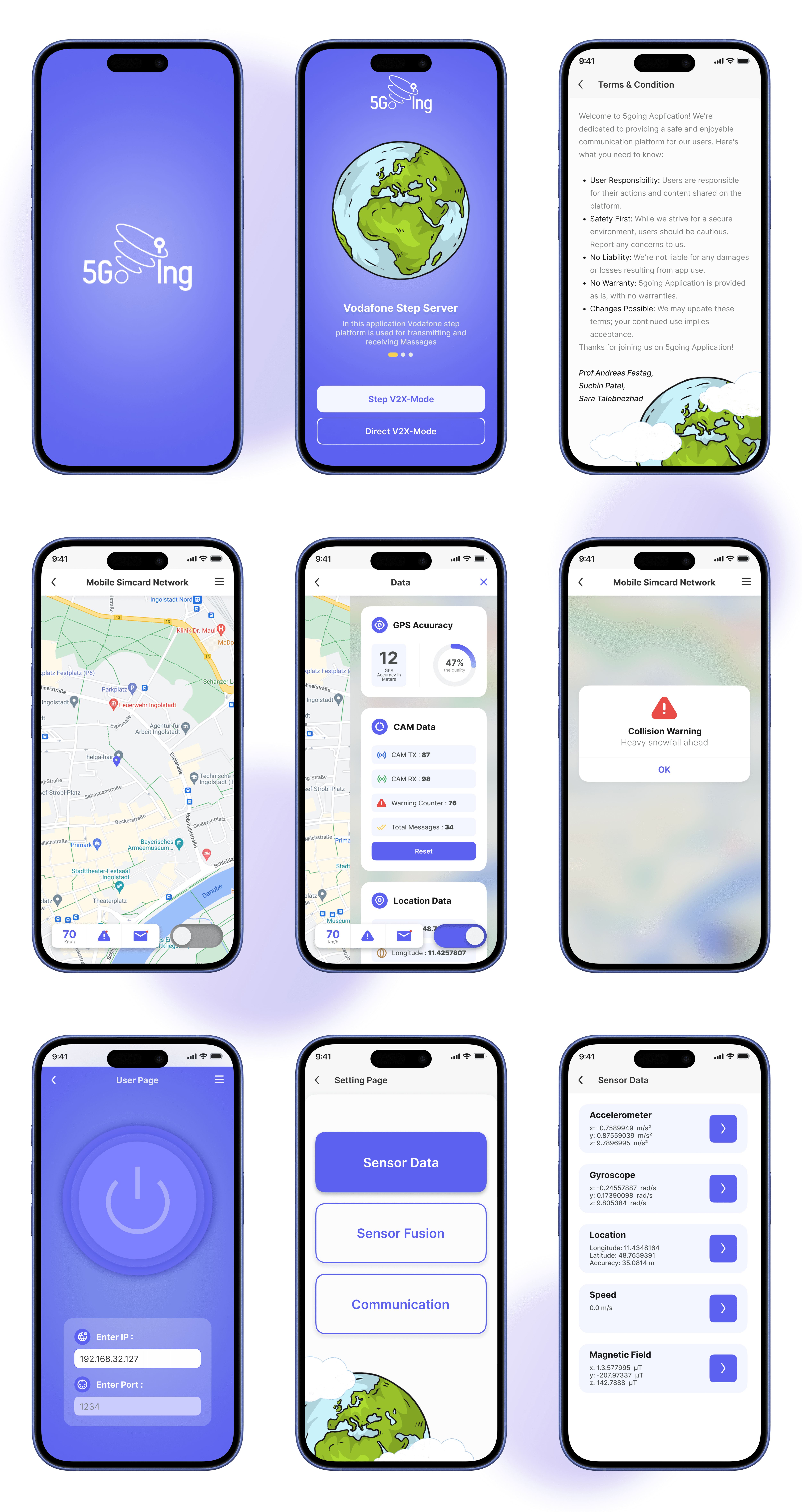
Designed the full screen flow, onboarding, mode selection, live map, hazard warnings, and the data dashboard
Built a clean, legible visual system suited to quick, on-the-move reading
Designed clear warning states, like the collision alert, that communicate urgency instantly
Organized dense technical data (GPS accuracy, message counts, location data) into scannable, easy-to-read cards
Design Approach
The guiding principle was clarity under pressure. A safety app can't afford visual clutter, so I prioritized large, glanceable elements: a prominent speed readout, immediate warning pop-ups, and a data panel that breaks complex information into simple cards.
I designed a short onboarding flow to introduce the app's two modes, and gave critical alerts, like the collision warning, a distinct, high-contrast treatment so they're impossible to miss. Every element was weighted by how urgently a moving user needs it.
Outcome
The design was implemented into a working mobile app used in a live V2X demonstration environment. It successfully receives and displays real-time safety messages in both operating modes, surfacing hazard warnings the moment they matter.
What I learned: designing for safety-critical, real-time contexts means ruthless prioritization. Every element competes for a user's limited attention, and clarity always wins over decoration.
5going
Overview
5Going is a mobile app that improves safety for vulnerable road users, such as cyclists and pedestrians, using vehicle-to-anything (V2X) communication. It receives real-time safety messages and warns users of nearby hazards, turning complex live data into a clear, glanceable interface. The app works in two modes, a network-based mode and a direct device-to-device mode, and was built as part of an experimental V2X demonstration environment.
My role: UI/UX Designer
Developer: Suchin Patel · Supervised by Prof. Dr.-Ing. Andreas Festag
Client
Research project at Fraunhofer IVI (Car2x Lab-THI)
Date
Categories
Car2x Lab
Mobile App
The Problem
Vulnerable road users have no simple way to receive the safety signals that connected vehicles already exchange. The design challenge was to take dense, real-time data, positions, hazard warnings, GPS accuracy, and message stats, and present it in an interface a cyclist or pedestrian can read at a glance, while moving, without distraction.
My Role
As UI/UX Designer, I owned the app's visual design and interface:
Designed the full screen flow, onboarding, mode selection, live map, hazard warnings, and the data dashboard
Built a clean, legible visual system suited to quick, on-the-move reading
Designed clear warning states, like the collision alert, that communicate urgency instantly
Organized dense technical data (GPS accuracy, message counts, location data) into scannable, easy-to-read cards
Design Approach
The guiding principle was clarity under pressure. A safety app can't afford visual clutter, so I prioritized large, glanceable elements: a prominent speed readout, immediate warning pop-ups, and a data panel that breaks complex information into simple cards.
I designed a short onboarding flow to introduce the app's two modes, and gave critical alerts, like the collision warning, a distinct, high-contrast treatment so they're impossible to miss. Every element was weighted by how urgently a moving user needs it.
Outcome
The design was implemented into a working mobile app used in a live V2X demonstration environment. It successfully receives and displays real-time safety messages in both operating modes, surfacing hazard warnings the moment they matter.
What I learned: designing for safety-critical, real-time contexts means ruthless prioritization. Every element competes for a user's limited attention, and clarity always wins over decoration.


